

Grocery/Meal/ Recipe Mobile App Prototype Design
Research


Pitch Deck
Final Results
Reflection
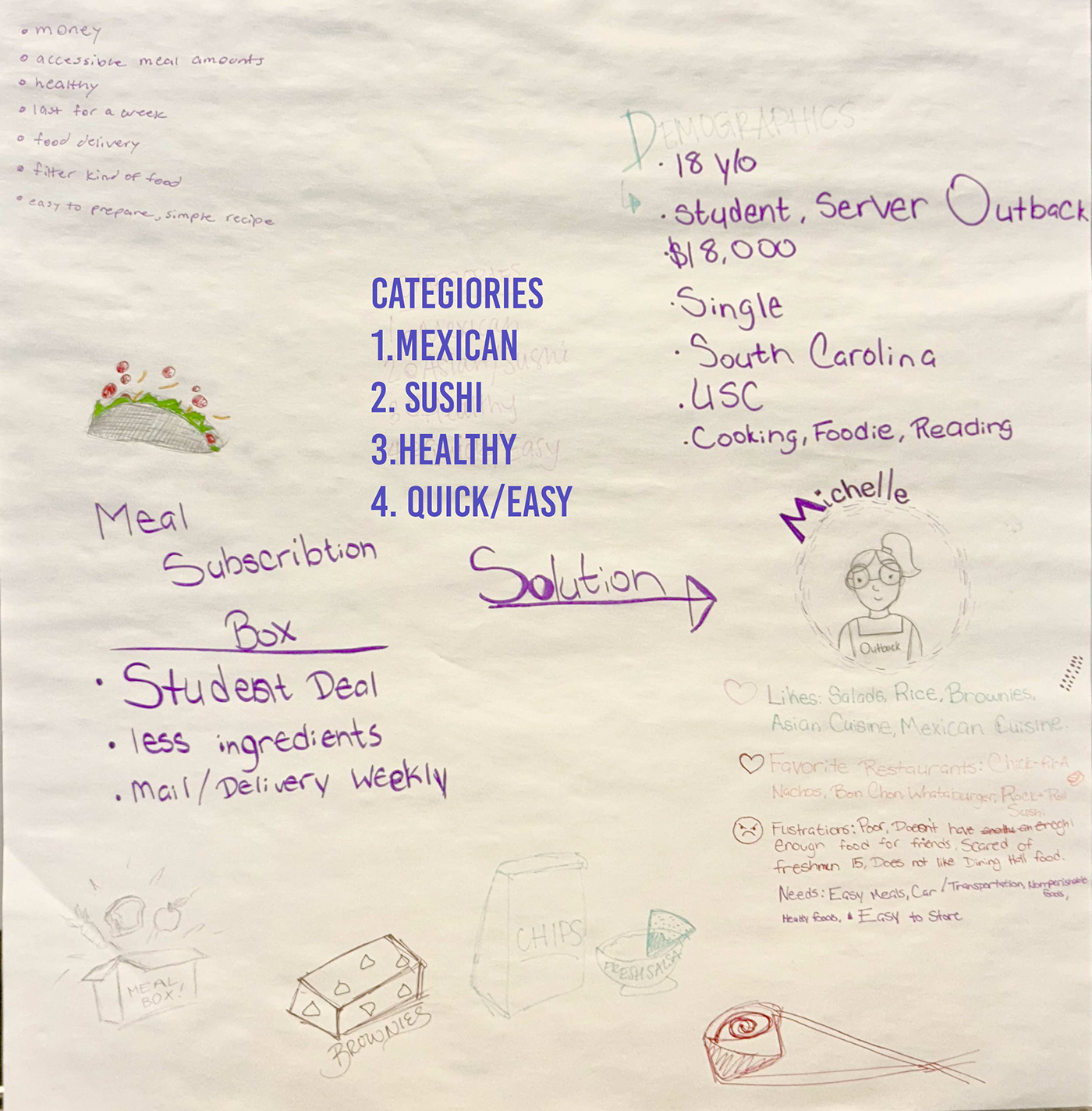
For this project I had to create a proposal and mobile app prototype for a Grocery, Meals, or Recipe App to be funded by a Fortune 500 grocery retailer. I utilized the Persona as a UX/UI Research Method to help guide my design decisions and brand style. I incorporated skills. I learned in two design when it came to the colors I use for the website. In two design, they taught us about color theory and the color wheeled so on the website, there are four main colors there’s green yellow, orange and purple. Green yellow and orange are analogous to each other on the color wheel, and purple is the complementary color for yellow. When making the logo for the app, I try to understand the audience who is looking at the app, the demographic. Associate, harsher lines and more square straight lines with people who are older and squiggly, bouncy round lines with people who are younger, and also women which help because the persona was a woman. Understanding the audience was taught in 3-D design, when presenting project to our classmates. When making the logo I had two different ideas, one was bubbly and the other was clean and more of the standard. I thought the second logo was standard due to when researching most fonts were very simple like it. I later switch to the standard one so it didn’t stand out but during class critiques I was told to switch back to the bubbly one.
Using what I have learned from 3-D design I took more time trying to understand how the client would view this and try to make softer and more appealing. I did this for my previous project when making the square space website. When making the square space website, I had very little gradient, but solid backgrounds, and for my style that is a lot more appealing to me personally, because gradient can be very distracting I use gradient for my previous project of making a website for a sports club, and I did not like the way that it looked. So I came the ability to make better decisions when it came to the background and the foundations of an app or website. For my previous project of making a website for sports club. There wasn’t a lot of function ability, and for this app I wanted there to be more so it’s not just a bunch of shapes on a page. Trying to make the interactions work on sigma was definitely a long Figma struggle and it made me realize that I do not like Figma. it took a long time trying to understand the interactions and trying to have them work properly for the prototype but I think it paid off. I know it’s not advance as some of my classmates. However, this is my second time using the app, and I very much tried my best, and even have an animation for the loading screen wasn’t as hard as the other functions.


